Client Website · Design & Development
Sancott Toxicology Advisors
A consulting website for Sancott Toxicology Advisors, built start to finish: requirements gathered directly from the client, a logo designed from scratch over several rounds of feedback, and a live site built with Claude's Design tool and hosted on GitHub Pages.
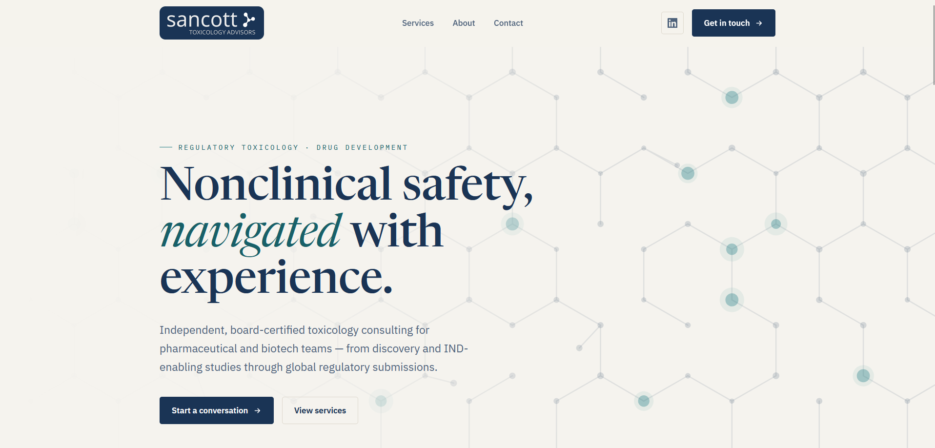
Starting with requirements, not a template
Before opening a design tool, I sat down with the client to figure out what the site actually needed to do. Sancott is a toxicology consulting practice, and the site needed to cover a bio and headshot, a services section (drug development consulting, ADME, formulation development, tox program buildout, and due-diligence work), a publications section, and a blog for staying current on regulatory topics like IQ Consortium guidance. It also needed room to grow: space to add collaborators and expand the list of services over time, rather than a static one-page brochure.
We looked at a handful of existing consultant sites together as reference points, mostly to talk through what felt dated or overly generic about them, and used that conversation to shape a site that felt more current and less template-driven.
Designing the mark
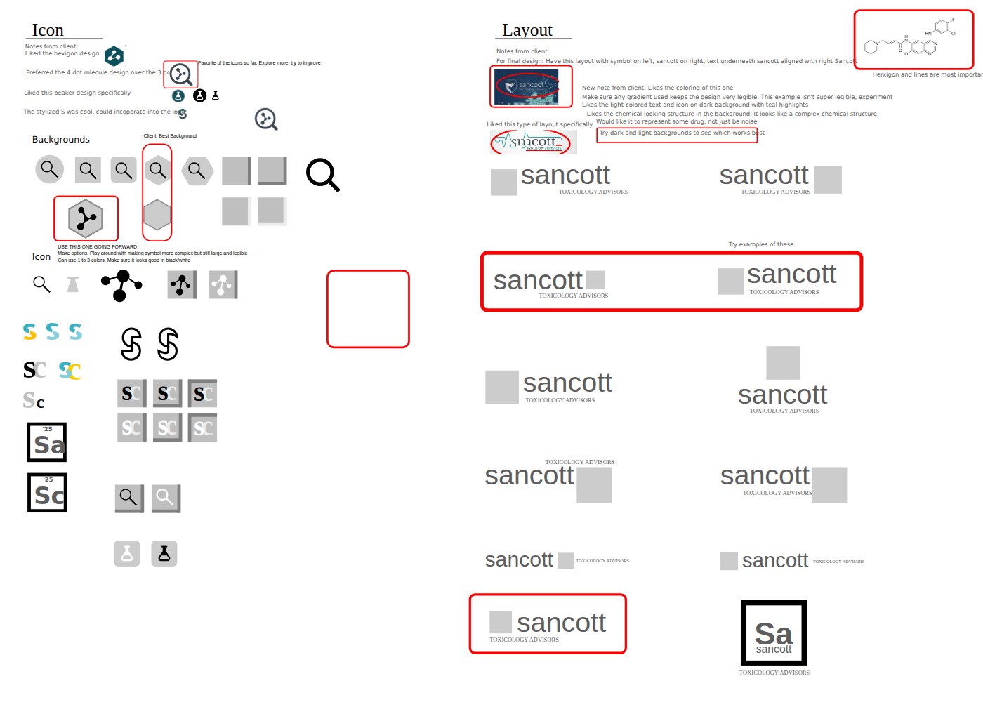
The client wanted a wordmark-plus-icon logo: "Sancott" as the dominant element, "Toxicology Advisors" as a smaller, swappable line underneath, in something crisp and professional and specifically not cartoonish or over-colored. I started with AI image generation to explore references and get a feel for the space, then moved to hand-creating the actual icon and layout concepts once I had a direction worth refining. I worked through those concepts side by side, including a beaker, a magnifying glass, a stylized "S," and a hexagon, before landing on a branching-node "molecule" mark. An early version used three nodes; the client preferred a four-dot variation, and asked for a version that read as an actual chemical structure rather than decorative noise.
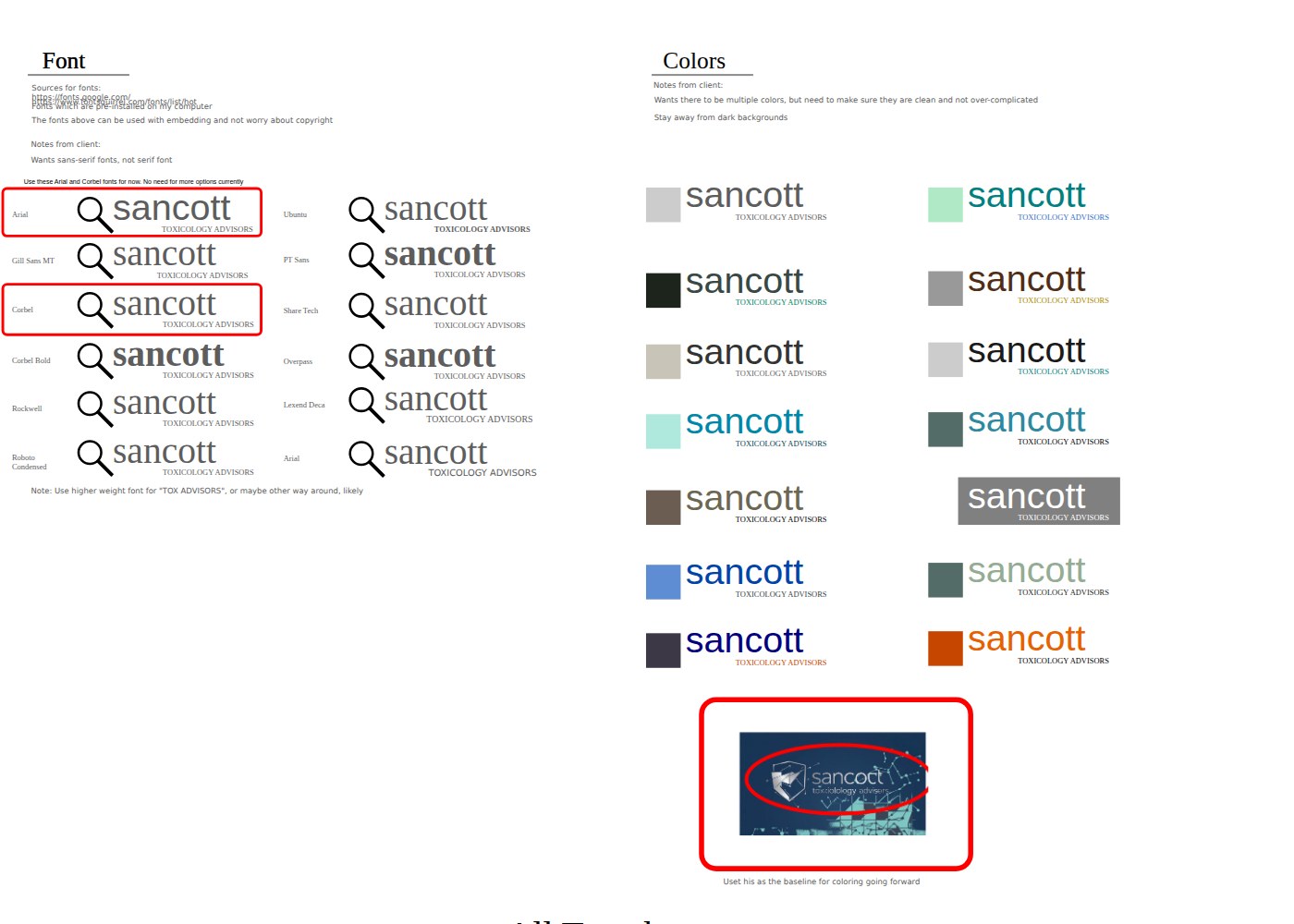
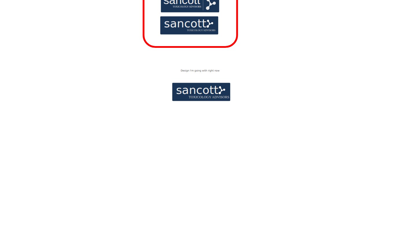
Typography went through a similar narrowing process: sans-serif only, tested across a dozen candidates before coming down to a final Arial-versus-Corbel comparison. Color told the most interesting story of the process. The client's early notes said to stay away from dark backgrounds, but a side-by-side mockup with light text and teal highlights on navy changed that, and that palette became "the baseline for coloring going forward." The final lockup settled on a navy background, a white wordmark, the molecule icon anchored to the right, and "TOXICOLOGY ADVISORS" set in small caps underneath, exactly the layout the client had asked for early on: symbol and text together, with room for that subtitle line to be swapped out later.
Building the site with Claude's Design tool
With the brand settled and the content requirements written down from the client conversation, I used Claude's Design tool to build out the actual site: the page structure, the services and publications sections, and a blog set up for ongoing posts on regulatory and industry topics. From there it was a round of iteration: sourcing supporting images, adding design elements, and refining layout and visual details, checking each pass against the notes from the requirements conversation, before pushing the finished build to GitHub Pages.
← scroll or drag to see more →